The Mission
Create a product animation that reframes Stripe Treasury as an active financial system, making a broad and complex product feel clear, connected, and intuitive through motion.
The Outcome
A polished Stripe product video combining expressive UI animation, cinematic transitions, and reusable motion systems to bring payments, currencies, cards, rewards, and AI-powered tasks into one cohesive story.
The Impact
The film launched across Stripe’s social channels around Sessions 2026, reaching 1.5M+ views on X with 5,000+ likes and 700+ reshares, plus 500+ likes on LinkedIn.
Client
Services
- Storyboard development
- Motion Graphics
- Music Synchronization
Software used
Figma
Illustrator
After Effects
Element 3D
Claude
ChatGPT
Google Docs
Rethinking what a financial account can do
Around Stripe Sessions 2026, I worked as an independent motion designer on a promotional video for the launch of Stripe Treasury.
The goal was to shift the perception of Treasury from a place where funds simply sit to a financial system where money can move, earn, get spent, and work across products, teams, and borders.
The challenge was to communicate all of this without turning the video into a list of features. We wanted to show Treasury as a financial operating system, bringing together global payments, multiple currencies, cards, rewards, and AI-powered financial tasks in one cohesive story.
Shaping the story
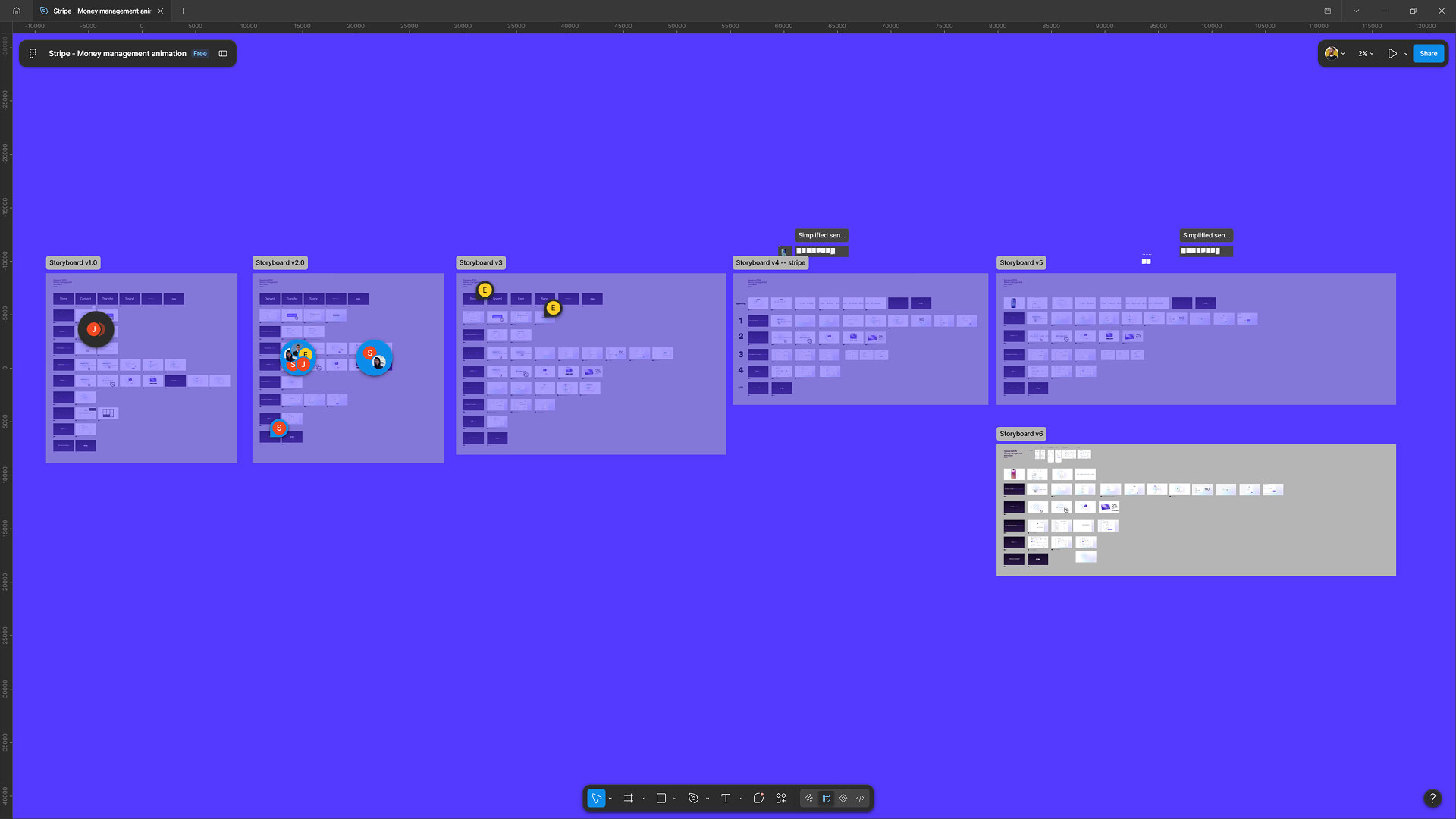
Stripe provided the initial storyboard, which started with the process of registering a company through Stripe Atlas before introducing Treasury’s features.
As the story evolved, we removed the registration sequence and started much closer to the action, with a payment arriving on a mobile device. From there, the animation follows money as it moves through different parts of the business—across accounts, currencies, payouts, spending, and eventually AI-powered tasks.
I rebuilt the storyboard in Figma using Stripe’s product UI as the foundation. Some elements stayed close to the real product, while others were simplified for animation. I worked with a Stripe designer to keep those custom elements visually consistent with the existing interface.
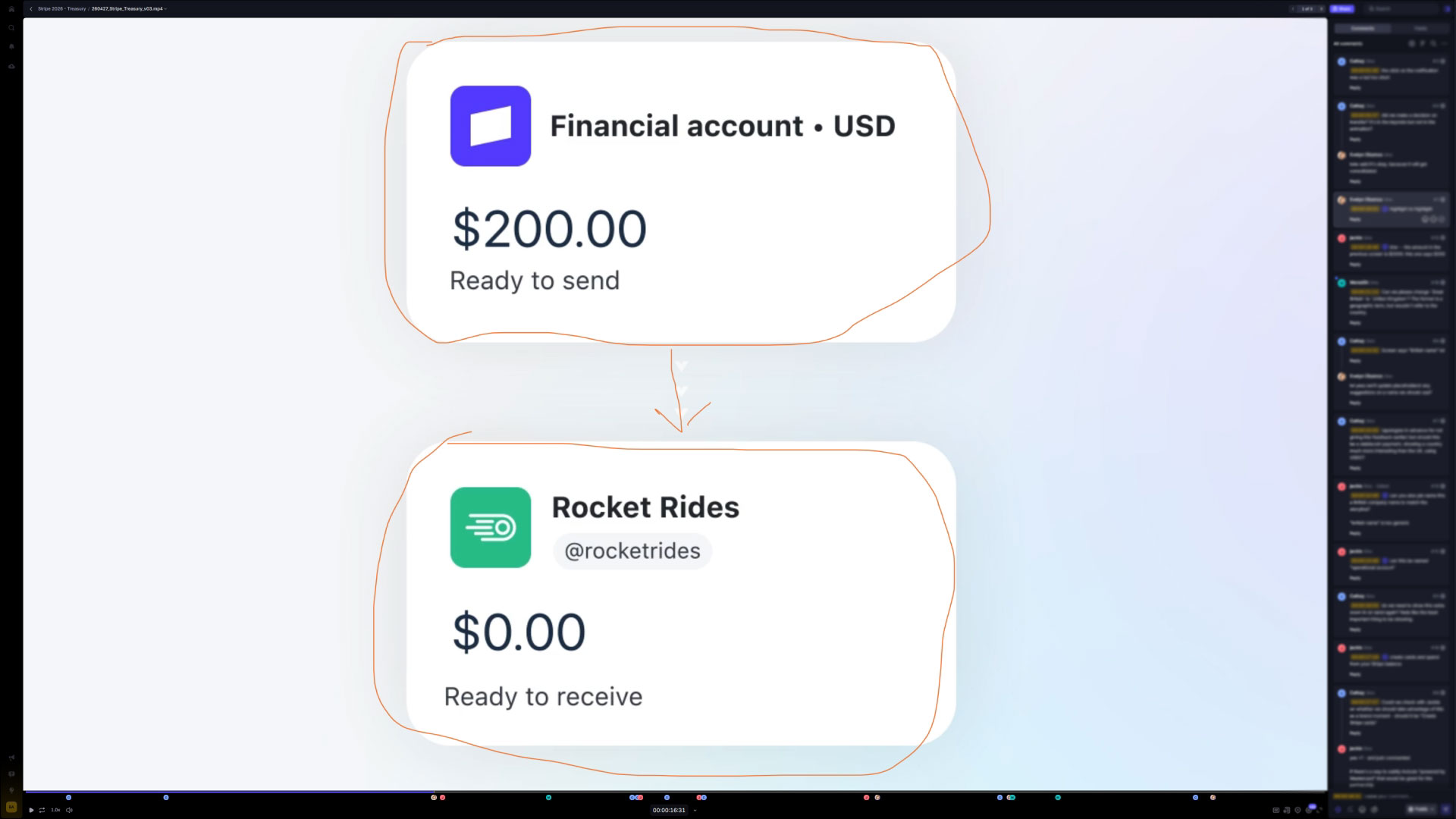
We iterated across both Figma and Google Docs: Figma for the visual direction and static frames, and Docs for refining the story and flow. Once production started, feedback moved into Frame.io.
Show, Don’t Tell
One of the key decisions was to let the UI do most of the explaining. Instead of introducing features with title cards, I used large UI close-ups and transitions to make the actions themselves the message. Buttons and interface elements could become almost the entire frame, creating emphasis without adding another layer of text. This kept the animation moving while still communicating a wide range of capabilities. The approach was simple: show the value rather than explain it.

“Eager to see how it works. And try it”
Pauline Cx
@Pauline_Cx

“This marks a major step change. Kudos to the team whose deep understanding of the problem made this kind of product possible.”
Katie Dill
@lil_dill

“Damn this is a beast”
Paul Millerd
@p_millerd
Designing for Change
Like most product animation projects, the product continued to evolve while the animation was in progress. Scenes were added, removed, and adjusted as the story became clearer, sometimes requiring changes to already animated sections. Late in production, the mobile Balances view changed to include another currency, while the AI agent experience moved from a web interface to mobile. These changes affected timing and transitions, but building reusable animation systems helped keep the work flexible. It was a good reminder that product animation needs to be designed not only for the final product, but also for the changes that happen along the way.
Motion Systems
I wanted the motion to feel polished and distinctly Stripe while keeping the interface at the center. Gradient outlines became a recurring device for highlighting important UI windows and guiding attention through transitions. I also built reusable After Effects systems for animating numbers and values, as well as a rig for the UI highlights. These small systems made it easier to maintain consistency and iterate quickly as the animation changed.
An AI-Ready Interface
One of the more forward-looking moments is the AI agent interaction. Rather than presenting it as another feature inside the dashboard, we show it through a mobile conversational interface. The user can ask for their financial information and then instruct the agent to complete a task, such as paying an invoice.
The interaction is deliberately simple. It shows the idea rather than explaining it: financial tasks can move from something you manually navigate to something you can simply ask to have done. The scene also evolved during production, moving from a web-based concept to mobile. That made the interaction feel more personal and connected it naturally to the mobile opening.
Making the Card Move
The card-creation scene gave me an opportunity to step slightly outside the UI. I received a flat Mastercard design from Stripe, but instead of introducing the card benefit with a title card, I used the card itself as part of the transition. I rebuilt it in 3D and had it emerge from the interface before spinning into the next scene. It adds a small commercial touch while making the action immediately tangible: we’re watching the card being created rather than simply being told about it.
Building the Final Dashboard
The final scene brings everything together. For the first time, we see the full Treasury dashboard. The individual components we’ve encountered throughout the animation fall back into place, rebuilding the larger interface and giving the ending a sense of spatiality.
The transaction table was also built as a reusable system. Rather than animating each row manually, I used expressions to drive values such as amount, description, balance, and date from a single composition. That made the table much faster to build and, more importantly, easy to adjust when the product or story changed. Tables might not sound like the most exciting part of motion design, but I enjoy finding ways to make repetitive UI elements feel dynamic.
“We’re live CONGRATS!!! Thank you so much for all your incredible work, Bart!”
EVELYN OBAMOS BRAND COMMS, STRIPE
The Result
The final animation launched across Stripe’s social channels around Sessions 2026. On X, it reached approximately 1.5 million views, with more than 5,000 likes and 700 reshares. On LinkedIn, it received 500+ likes based on publicly visible engagement.
For me, the most rewarding part was finding a way to communicate such a broad product without making the video feel like a feature list. The story is built around movement—money moving between accounts, interfaces transforming, data coming together, and AI taking action. It felt like the right visual language for Treasury: not just a place where your money sits, but where your money works.
Ready to show your
innovative ideas?
Tell me about your project and goals. I would love to help.