The Mission
Create a clear and inviting entry point for people unfamiliar with the KnowledgeBase product. The goal was to deliver a highly shareable product video that supports acquisition and helps convert first-time viewers into customers.
The Outcome
I led motion design for a brand-new explainer video that communicates KnowledgeBase’s value proposition in a concise, engaging, and visually refined way.
The Impact
Placed in the hero section of the website, the video helped attract new users and improved conversion on the main page by making the product easier to understand at a glance.
Client
Services
- Storyboard development
- Music research
- Art direction
- Motion Graphics
Software used
- Google Docs
- Figma
- Figma
- Illustrator
- After Effects
- Element 3D
- Cinema4D
KnowledgeBase is built to reduce friction in customer communication. It helps teams answer questions faster, stay consistent, and avoid repeating the same information again and again. When we started this project at Text, the existing explainer video no longer reflected the product or the brand. It felt outdated and overly dense, making it harder for new users to quickly understand the value.
My role was to lead motion design and help turn the product into a clear, engaging story. The goal was to create an explainer that works as a first point of contact, especially for people encountering KnowledgeBase for the first time.
Defining the Challenge
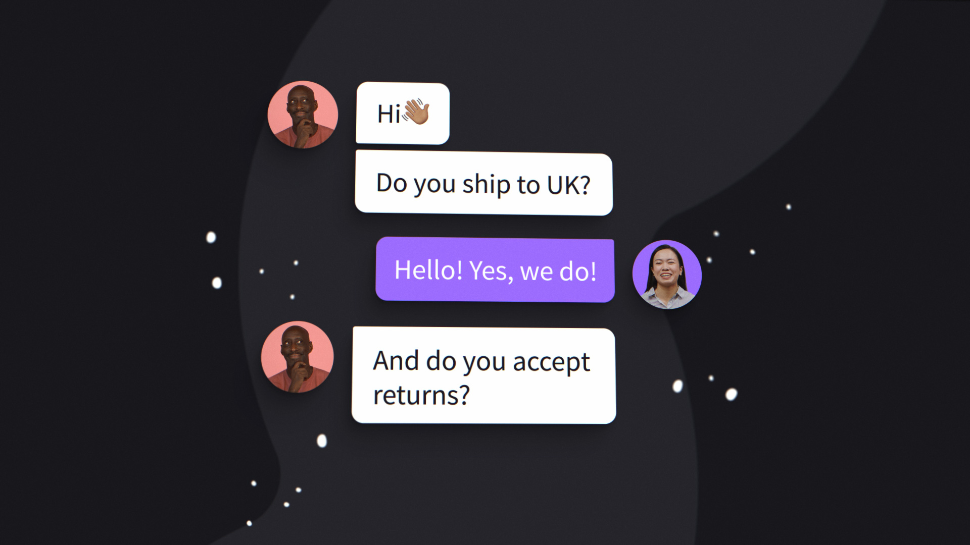
The challenge was not a lack of features, but the opposite. KnowledgeBase offers a lot, and the risk was trying to say everything at once. We needed to simplify the message, shorten the runtime, and focus on moments that truly matter to users.
From the beginning, we knew the video had to be easy to share, easy to understand, and strong enough to support acquisition. Every design decision had to balance clarity, pacing, and personality.
From Script to Storyboard
I started by translating the draft script into a rough storyboard. At the same time, I asked for access to the KnowledgeBase product so I could explore the interface directly. Clicking through the app, testing interactions, and observing how content behaves helped me make better decisions about what should be shown literally and what could be abstracted through motion.
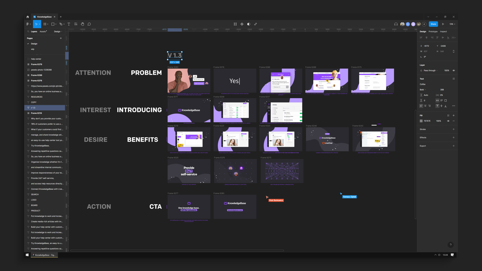
Once the final script was ready, I updated the storyboard to reflect the refined structure. From there, the graphic designer created the first look frames. Through several design critique sessions, we iterated on composition, color, and visual hierarchy until we landed on a direction that felt both modern and aligned with the brand.
Adapting When Things Go Wrong
Not everything went according to plan. The voice-over delivery was delayed, which could have slowed production. Instead of waiting, I moved forward by importing assets from Figma into After Effects and building scenes in parallel. That decision helped us keep momentum.
Then another issue surfaced. One sentence from the script had never made it into the storyboard. I only realized it once the recorded voice-over arrived. At that stage, reworking the structure was not an option.

The solution came quickly. I introduced a simple but expressive moment built around a bright yellow animated face and the large on-screen text “Yes. :)”. It captured the quiet frustration of answering the same customer question over and over again. What started as a mistake turned into a moment of humor and honesty that reinforced why KnowledgeBase exists in the first place.
Designing Energy Into the Interface
Even transitional moments were treated as opportunities to engage the viewer. During the loading sequence, the KnowledgeBase name appears letter by letter, each character moving in a subtle wave. This small detail adds rhythm and energy, turning a passive moment into part of the experience.
I wanted the animation to feel responsive and alive, not static. These early cues help set expectations and keep attention before the core features are even introduced.
Highlighting Key Features
One of the most exciting parts of the project was animating the drag and drop functionality. It is a key feature of the product and central to how users create and manage content. To emphasize its simplicity and speed, I used close-up shots and placed the interface in a soft three-dimensional environment.

Motion curves were carefully tuned so interactions felt natural and effortless. The goal was not to impress with complexity, but to communicate ease of use in a way that feels believable.
Microinteractions across the interface played a similar role. Icons and navigation elements did not simply appear. Each movement had intent, reinforcing the sense of a thoughtfully designed product and guiding the viewer’s attention without distraction.

Turning UX Into Story
The animation follows the logic of real user behavior. Scrolling is treated as motion, with interface elements responding smoothly as if touched. When showing the integration with LiveChat, articles appear line by line in a staggered sequence. The motion suggests abundance and accessibility, helping viewers intuitively understand the value without explanation.
Toward the end of the video, abstract dots connect and transform into user avatars, visualizing how knowledge flows between teams and customers. This network gradually resolves into the KnowledgeBase logo, closing the story with a clear and meaningful transition into the call to action.
Outcome and Impact
The final explainer video became a primary entry point for new users. It was embedded in the hero section of the website and used in paid campaigns. Alongside the main video, I created a set of supporting web animations for the landing page to maintain consistency across the experience.
By simplifying the message and refining the motion language, the video helped users understand the product faster and supported improved engagement and conversion on the main page.

“Bartłomiej was professional, creative, and always willing to go the extra mile to make sure we were satisfied. The entire collaboration was seamless and enjoyable due to his attention to detail.”
PIOTR BORKOWICZ MARKETING MANAGER, KNOWLEDGEBASE
Reflection
This project reinforced how important it is to balance strategy with intuition in motion design. Clear goals, thoughtful process, and attention to detail create structure, but personality and emotion are what make the story resonate.
The “Yes. :)” moment is a good example of that balance. It is small, slightly uncomfortable, and very human. Those moments often make the difference between an explainer that informs and one that actually connects.
CREDITS
| Production | KnowledgeBase |
| Project Management | Piotr Borkowicz |
| Art Direction | Bartłomiej Otłowski |
| Motion Design | Bartłomiej Otłowski |
| Graphic Design | Agata Dubaniowska |
| Script | Tomasz Ziętek |
| Audio Edit | Arkadiusz Syrowiec |
Ready to show your
innovative ideas?
Tell me about your project and goals. I would love to help.